Quote Form Redesign
Scaling sales without hiring
Context
The Set Up
Logrock is a B2B insurtech company in the trucking insurance market. Their sales team had a costly bottleneck: producers, insurance agents, were spending too much time with non-qualified leads.
The sales workflow had three stages:
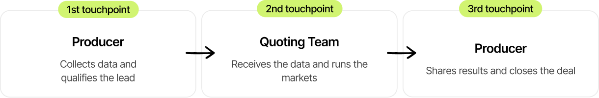
The goal was to scale revenue without growing headcount, and the first touchpoint was the obvious target. If producers only engaged at stage three, they could focus entirely on qualified leads.
The solution: a self-service quote form. Customers would fill it out independently, the quoting team would receive the data automatically, and producers would only engage to close the deal.
The idea was good. But that wasn't happening in reality.
The Problem
What Was Actually Happening
Stats were
(no responsive version)
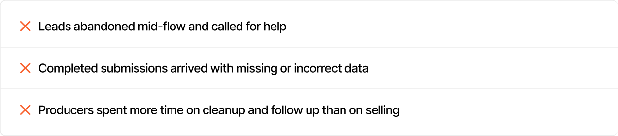
The form didn't eliminate phone calls. It multiplied them.
***
But why were so many users
abandoning the form?
The User
Who Was Using This
To answer that, we first needed to understand who was actually using it. Based on producer interviews, customer service conversations, and phone recordings:

They were
Independent truck owners & small businesses.
These users had intent. A landing page before the form acted as a natural filter, separating browsers from buyers. Those who started the form wanted rates.
63% abandonment wasn't lack of interest. It was the form failing people who were actively trying to complete it.
Understanding the user made the causes obvious:
The form wasn't built for them.
Discovery
What I Found
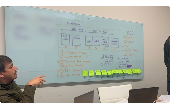
I went on-site to the agency in North Carolina with the PM, before forming any hypothesis. We combined on-site shadowing and producer interviews with Hotjar session recordings, customer phone recordings, and funnel data from Google Analytics and Mixpanel.
User Perspective
From a user perspective, the experience felt confusing and overwhelming. Users struggled to understand what they were filling out due to the use of insurance jargon, which often led to uncertainty and hesitation during completion. Many users either abandoned the form midway or rushed through it just to reach the final call.
This confusion was compounded by a lack of structure. The form was long, not logically segmented, and not properly optimized for mobile. As a result, over 60% of users accessing it via mobile dropped off, while the remaining users experienced friction due to poor information architecture and lack of orientation within the flow.
These two issues directly impacted data quality. Even when users completed the form, submissions often contained errors or missing information, which required follow-up calls to correct or validate the data. This created inefficiencies in the downstream process and increased operational overhead.
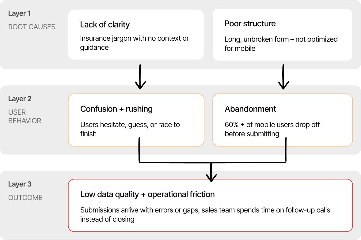
What emerged from analysis was that these were not separate problems, but interconnected ones: lack of clarity led to misunderstanding, poor structure increased cognitive load and fatigue, and both contributed to rushed or incomplete submissions, resulting in low-quality data and additional operational friction.
Previous Original Form
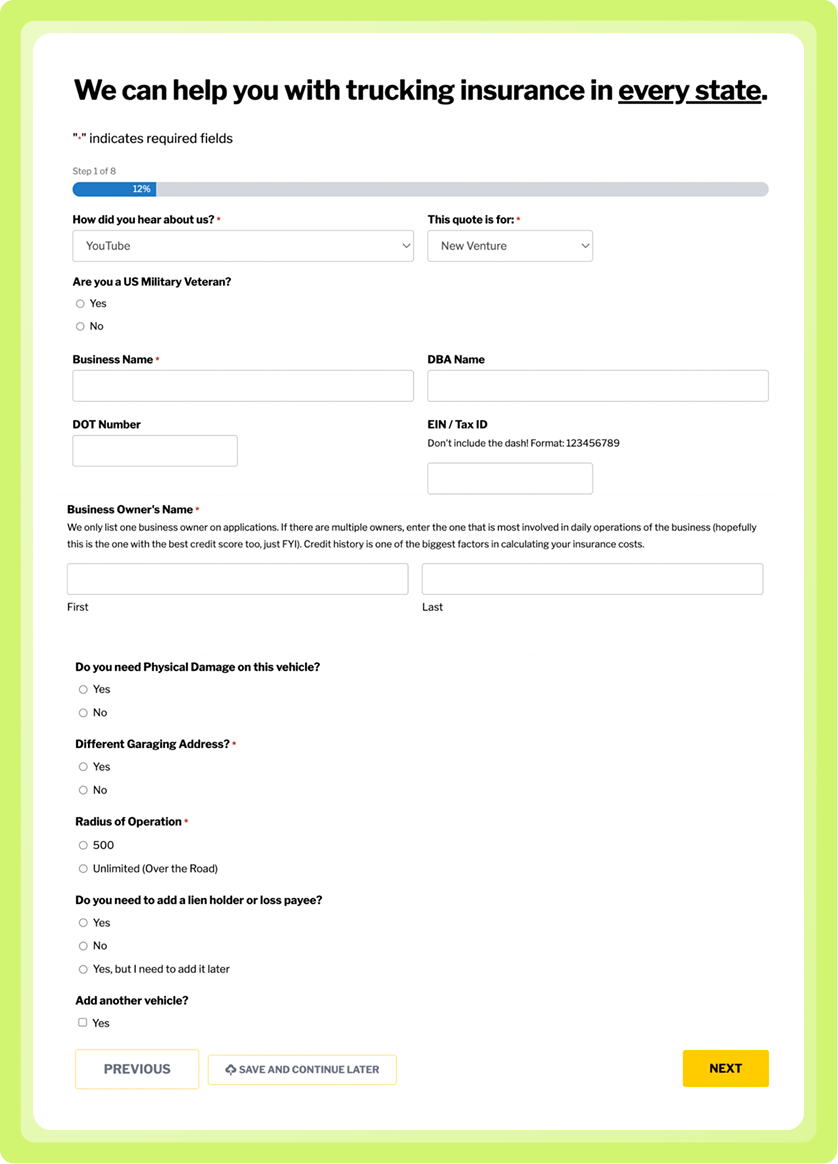
*Screenshot from the real form.
The Solution
How I Solved it
The redesign addressed these issues as a connected system rather than isolated problems, focusing on three key areas: clarity, structure, and data quality.
Clarity
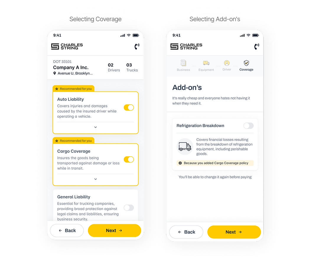
To improve clarity, all insurance terminology was replaced or supplemented with plain-language explanations, ensuring that even first-time users without prior knowledge could complete the form independently. Conditional logic was also introduced so that users only saw questions relevant to their specific situation, reducing unnecessary complexity and visual noise.
Structure
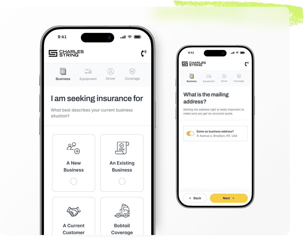
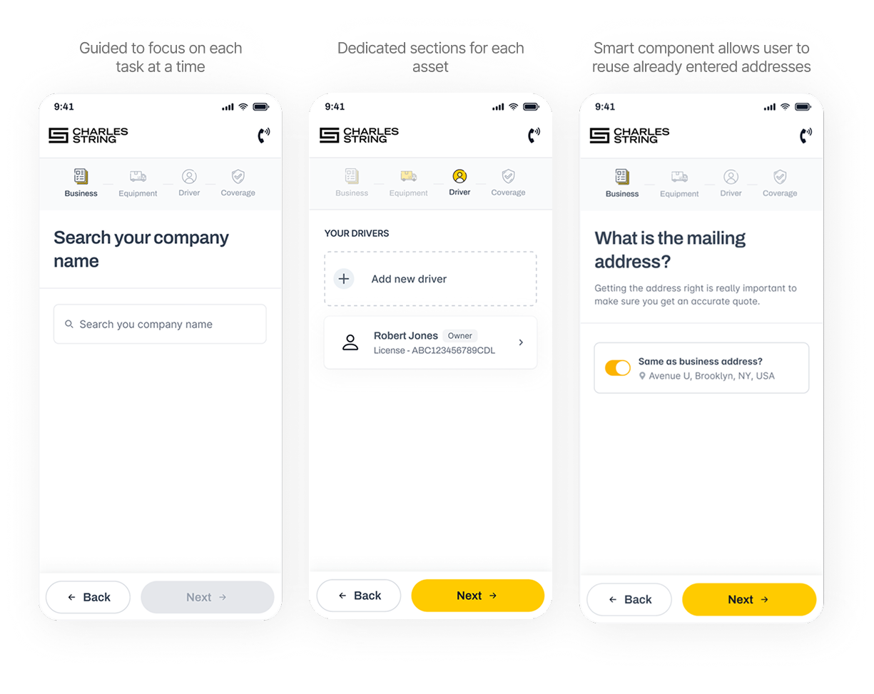
To improve structure, the form was broken into smaller, easier-to-digest chunks, and reorganized into four logical sections: Business, Equipment, Drivers, and Coverage. Each section became its own step, creating a clearer flow and helping users understand where they were in the process at all times. In addition, the experience was redesigned with a mobile-first approach to address the high drop-off rate on mobile devices.
Data Quality
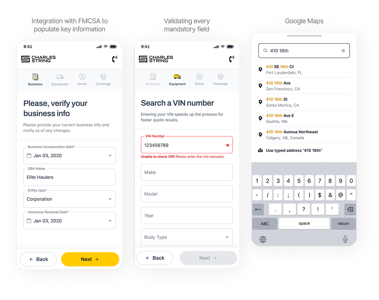
To improve data quality, autofill integrations were implemented using external compliance systems, allowing key information such as addresses, DBA names, incorporation dates, and equipment details to be automatically populated via DOT or VIN numbers.
I also integrated Google Maps to streamline address entry, as users were required to input the garage address repeatedly when adding new trucks. This reduced redundant manual input and minimized errors.
Step-level validation was also introduced, with inline and plain-language error messages that prevented users from advancing with missing or invalid fields.
The Impact
What Changed
Launched October 2024. Measured January 2025, 3 months post-launch, via Mixpanel, Hotjar, and AgencyZoom.
| Metric | Before | After | Impact |
|---|---|---|---|
| Completion rate | 35% | 67% | +89% improvement |
| Time per lead | ~30 min | 9–12 min | 70% time reduction |
200+ conditional paths live in production at logrock.com since October 2024.
Producers stopped being support agents for a broken form. They became closers again.
Conclusion
The Takeaway
The idea behind the form was good. What was missing was execution that respected the real user, not the expert who built it. When the form started speaking the user's language, working on their device, and protecting the data it collected, it finally delivered what the business was looking for.
What I'd do differently?
I'd pursue direct access to end users earlier in discovery. The research was strong with producers and domain experts, but limited with the truck owners actually filling out the form. Some edge cases that emerged post-launch could have been caught earlier with usability testing directly with users before launch.